
How Coffee Talk became Duolingo for millennials with gamification

400
Users in the first two months with zero marketing
1st
Application with a solution like this in its country’s marketplace
About project
Gamified EdTech platform for learning English
Coffee Talk is a gamified platform for learning English that focuses on activating passive language knowledge. Created by an English teacher it offers a customized experience with different learning packages and teachers assigned to students based on their preexisting knowledge and needs. Teachers have their version of the platform for delivering all the materials and tracking student progress. Homework, tests, voice, and writing exercises made by teachers paired with gamified features help students learn in a fun and easy way.
Client name
Nina Jagodić-Kuridža
Industry
EdTech
Location
Serbia

Challenge 1
The client wanted a secure solution with strong data protection
Challenge 2
The platform had to be scalable because new languages and methods will be added soon after launch
Challenge 3
The platform had to be easy and fun to use

Solutions
Encryption and secure data handling
To address the data protection we implemented robust encryption protocols and procedures. All sensitive information, including personal data and analytics, is encrypted during transmission and when stored. Regular security audits and updates help identify and minimize the risk of any potential vulnerabilities.
Modular architecture for scalability
To ensure scalability we adopted a modular architecture approach for the platform. Each component is designed as a separate module so integrating new elements in the future will be easier. This modular design also ensures that the performance won’t be compromised at any point. Additionally, we implemented API-based communication between modules, to ensure flexibility and interoperability across different components of the platform.
Gamified learning experience
To create an engaging and user-friendly platform, we used gamification inspired by apps like Duolingo. Every activity on the platform revolves around the app’s mascot that helps with onboarding, homework, practicing, and learning. Interactive exercises and quizzes are created for the millennial targeted audience to make learning more fun. A visually interesting and intuitive user interface improves the overall user experience. It also makes it easy for users to navigate the platform and track their progress.
The Result
35
Tables in the DB
>130
Screens for admin and user platform
The result was an EdTech solution that helps people learn English with ease. A user-friendly, interactive, and scalable solution that speeds up the learning and teaching process. The platform allows online paying, time tracking, and voice exercise making things easier for all users - students and teachers. Gamified elements combined with engaging content and professional support make this app a market hit.
Visual results


Key Features
Voice recording
The platform allows users to record voice assignments that professors can review and give feedback on. This helps students improve their verbal skills.
Most common mistakes
This feature recognizes what mistakes students make the most and highlights them. This way students and teachers know what to focus on. Also, these mistakes connect to additional articles that help students to correct them.
Gamification
A set of features used to motivate users and make the learning process more enjoyable.
Time tracker
This feature is designed for teachers to track their time and calculate how much they’ve earned.
Stripe integration
Used for online paying.
Cross-selling and up-selling
These features show up on the dashboard and increase revenue by offering students to upgrade their plans.
Step by Step

Scoping
During this phase, we worked closely with the client to define clear project goals and establish key deliverables. Meetings and workshops helped us identify core features and functionalities. We also addressed the challenges of data protection, scalability, and user experience. This ensured alignment with the client's vision and objectives from the start.

UX Research
We researched the targeted audience to understand their behavior, wants and needs better. We talked with potential users and analyzed similar existing products on the market. This allowed us to create a user flow and user journey map that predicts user behavior based on user personas. By doing this we ensured that the platform would meet the needs of its targeted audience.

Style Guide
We developed a style guide containing typography, color palettes, iconography, and other visual elements, ensuring consistency. The style guide served as a reference for designers and developers throughout the design and development process. The dominant color is yellow - the color of the client's brand. We also used green and blue for gamification features for feelings of accomplishment and encouragement.

Design
With the design, we focused on usability, accessibility, and engagement. The design ensured intuitive navigation and clear communication of information through the user interface. Through design, the learning process was turned into visual segments that translated the user stories into graphic components. Gamified UI helps millennial users perceive the platform as a game. This way design encourages learning and makes navigation easier.
05Software Architecture and Development
With development and software architecture we prioritized flexibility, scalability, and security to address the client's requirements.
After the design was completed usability testing allowed us to find areas of improvement. We started with low-fidelity wireframes and prototypes to validate concepts and gather feedback from founders and future users. Regular testing ensured code quality and reliability.
Stripe integration allows online payments. We implemented robust security measures, including encryption, authentication, and authorization mechanisms to protect sensitive user data. We used JS technologies to optimize performance, reliability, and scalability.
The frontend and backend development was done in parallel. We used mantine design for frontend. The in-app notification system relies on an event bus mechanism to ensure that students and teachers get notified on time. This is very important when it comes to payments and homework reviews.
For recording voice assignments we used the media recorder from HTML. This allows students to practice their verbal skills and address any problematic areas that are overlooked in written exercises. This is the key functionality for our client and their method of working.


Testing and Collecting Users' Feedback
Testing is part of our working process from the start. We test after adding every feature and achieving each milestone. However, when the product is ready to launch we test it again to ensure everything is working properly. We then start the beta testing phase and see how the platform performs live. This way we can gather real-time user insights. After launch, we focus on fixing bugs and improving the platform even more.


Choosing brigit.dev turned out to be the best decision for our project.
With their help, we created the CoffeeTalk platform with an innovative way to improve English conversation through voice messages. Their design was fantastic, and they really thought about the customer journey, not just the features. What really stood out to me was how the team actually cared about our project. Their dedication and support made the whole process not just successful, but truly enjoyable.
Nina Jagodić-Kuridža
Founder & CEO - Coffee Talk
More Case Studies


Bijlex
A team of educators set out to simplify how students learn and how teachers manage their work. Bijlex helps schools struggling with engagement and clarity by offering structured, personalized learning paths. It enables students to follow lessons with ease while giving teachers full control over the flow of materials.
60+
Database tables and over 100,000 content entries
1st
Presales and pilot testing with schools across the Netherlands


Ride & Stride
A company set out to make daily commuting more efficient, active, and sustainable for their team. Ride & Stride helps coworkers connect and plan shared rides or solo commutes with ease. It encourages greener choices by combining convenience with real-time CO₂ savings and wellness tracking.
Complete mobile MVP with role-based journeys for solo users, drivers, and passengers
Real-time ride coordination and CO2-saving tracking
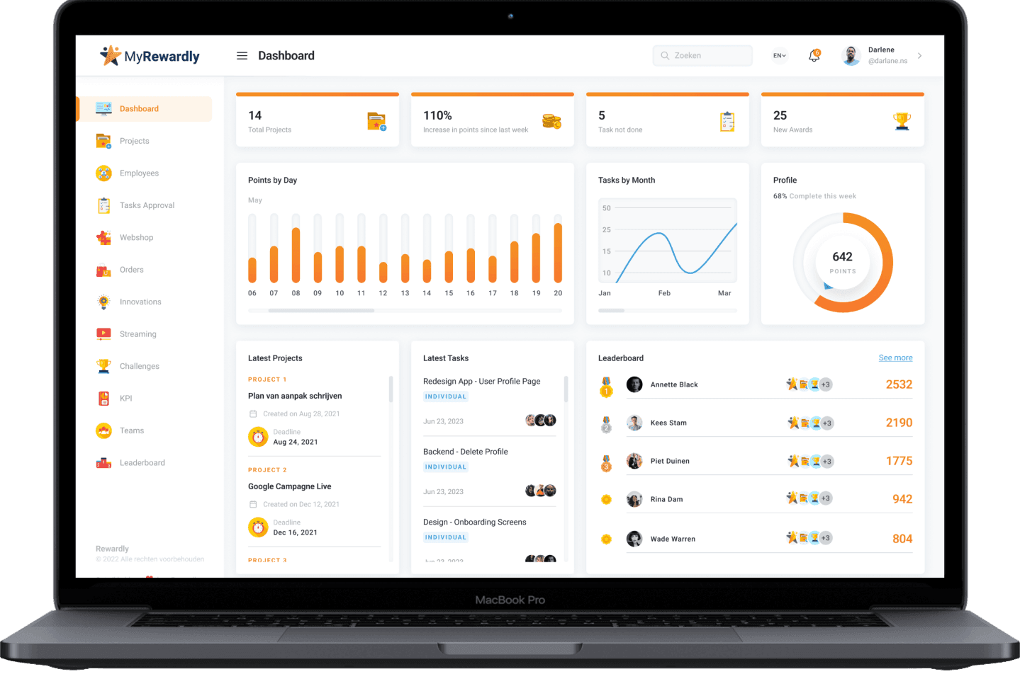

Rewardly Task Manager
Ex-Google sales expert wanted to boost productivity and increase profit with a single software. The solution was a platform with gamified features. Now, the software helps companies struggling with performance and motivation by turning work into play. Learn how we used gamification to improve motivation with a single SaaS solution.
1M
Estimated value after 6 months
50+
Clients
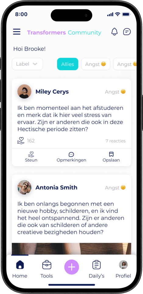

Transformers Community
A visionary therapist from the Netherlands, wanted to create a safe space for everyone. This idea turned into the Transformers Community - social media for mental health. Read more and learn why this platform became the go-to social media for many young people.
1st
App with a solution like this on the market
Won
Oranje Fonds
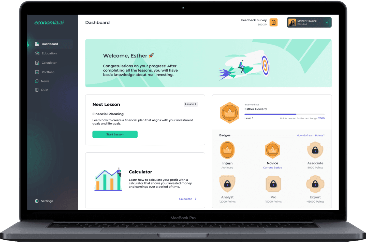

Economia.AI
Two innovation and investment banking experts came up with a brilliant idea – how to make investing and finance more accessible. The solution was a FinTech and EdTech platform for informing and learning with personalized insights into the world of investing and hypothetical portfolios. Read more and learn about gamified features and discover how Economi.AI makes learning about investing fun.
Huge
Ecosystem interest
1st
Application with a solution like this on the market
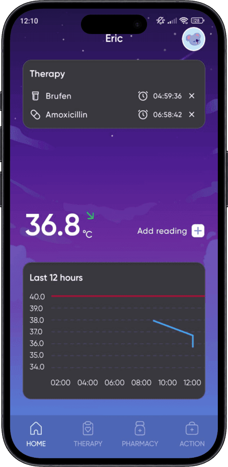
BabyFM
Created by experts in the medical field this modern solution helps new parents. BabyFM combines software, hardware, and AI to monitor and record the two most important parameters in early development - temperature and medication. It allows real-time updates that make parents’ lives easier. Read more and learn how we made this unique solution function effortlessly in the homes of users everywhere.
Huge
Interest in the community
Patented
Solution

Belex
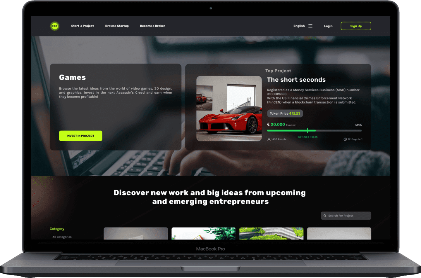
A blockchain platform that connects entrepreneurs with investors. Belex makes it easy to fund innovative ideas and discover new opportunities. It combines the best of both worlds for mutual profit. Read more and learn how we use blockchain in our projects.
No.1
Blockchain crowdfunding platform
The best
Startup choice

Robin Assistant
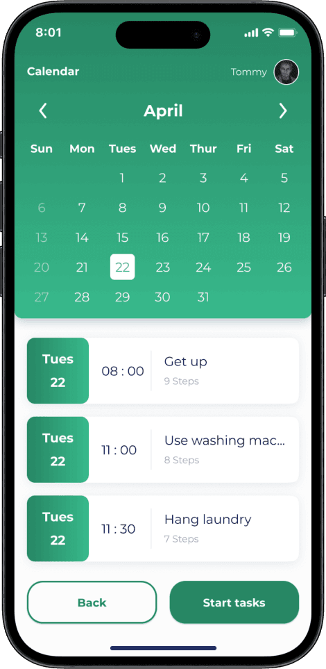
A Dutch professor wanted to improve the quality of life for mentally challenged people. The solution was an assistive application connected to the web with AI intended to help users with everyday activities. Read more and learn how we used AI to build an offline-first app connected to a web platform.
1000+
Signed up for BETA
15
Partner hospitals

ReWear
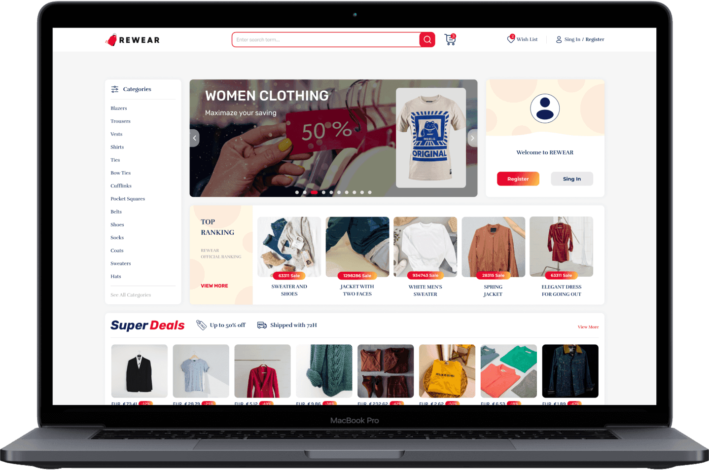
A businessman wanted to create a space for people to sell clothes and accessories made by smaller businesses. The solution was ReWear - a platform that gives people a chance to explore clothes beyond fast fashion labels. Read more if you want to know how we made smaller brands trendy with customized elements.
1st
Choice by small businesses
3000+
Users in first year

Primous
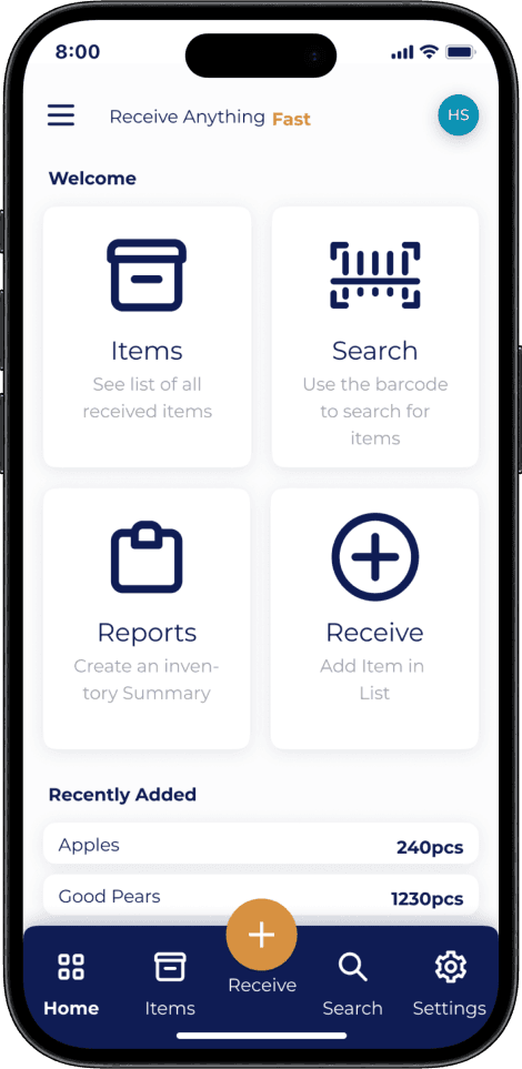
Developed for a warehouse company, Primous helps employees and managers reduce the number of repetitive actions and working hours. The software makes warehouse management easy even for those who are less tech savvy. Read more and learn how management systems can be simple but effective.
Uncountable
Saved hours for the employer
200+
Employees using application
Reach out today
To understand your idea better and see if we are a good fit reach out and get all the information you need to start building your idea today.
Get in contact
Tell us what you want and our team will answer you within 6 hours. We offer a variety of services so choose the one that fits you the best.
Contact Us